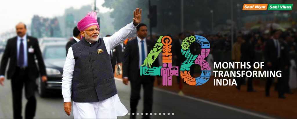
Government websites have been notorious in the past for being dull and boring, coupled with slow loading speed and even slower processing speed. The designing of the website too used to be done in a very unprofessional and lazy fashion. Half of the icons were redundant. All of these were things of the past. The union government had set on the path to revamp the government websites. A continuous approach towards this had been made from the past four years. From Indian Railways to the official site of government, mygov.in all the websites have undergone a drastic change to keep up with the changing times. The revamp includes, direct links to portals, suitable icons and best in class designing and placement of icons. Real time upgrades can easily be seen on the mygov.in website which keeps tracking advancements in LPG connections to Beneficiaries under PM Jan Dhan Yojana fields in real time. The difference between the old and new websites is pleasing to the eyes and is likely to give top private company websites a run for the money. The ease with which a common man today can have a look at the various government projects which are underway is astounding.
It all started with Mr. Piyush Goyal taking over the power minister portfolio in the central government. Mr. Goyal overhauled the entire website of the power ministry and added important icons which the site was previously lacking in. He also added the real time counter for the first time so that people could keep track on the real time advancements in power distribution taking place. The portal became an instant hit and was actively tracked by a lot of common people. PM Modi took notice of the response the new website had received and ordered all the ministries to remodel their websites on similar lines. Official website of the government mygov.in has launched a fresh new website which is beautiful to look at and has many things to offer. These websites have been an instant hit of the public, government interaction with the people have drastically increased ever since these changes have taken place.
IRCTC website too has undergone a massive change under Mr. Piyush Goyal. Users visiting IRCTC homepage now have the chance to know the probability of confirmation before they actually book the tickets. The IRCTC website is user-friendly and looks appealing to the eyes, the addition of user friendly measures such as less typing and less scrolling have been termed as ‘Ease of Travel’ by the Railway Minister.
The remodeling of these websites has led to efficiency and ease for the end user. A drastic increase in smartphone and internet users had made it compulsory for the government to enhance the performance of its websites. PM Modi’s farsightedness has ensured that the people got what they deserved. The government is now available for them 24*7*365 at their fingertips. Enhanced security measures have also been taken to ensure safety of the data which users submit at government websites. These measures are proof of the new image of India which is being monitored by people throughout the world. The developments taking place in the country are boosted by developments on the web. This shows the attention to detail put in by PM Modi in developing India, cabinet minister Piyush Goyal and other developers and designers who have put in a lot of hard work to achieve this goal too deserve a hearty round of applause.
