According to Wikipiedia, A pie chart (or a circle chart) is a circular statistical graphic, which is divided into slices to illustrate numerical proportion. In a pie chart, the arc length of each slice (and consequently its central angle and area), is proportional to the quantity it represents. While it is named for its resemblance to a pie which has been sliced, there are variations on the way it can be presented. The earliest known pie chart is generally credited to William Playfair’s Statistical Breviary of 1801.
Technical definitions aside, Pie Charts are probably the simplest and sometimes a very funny way of understanding data.
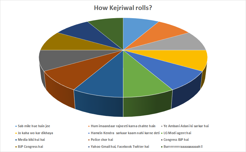
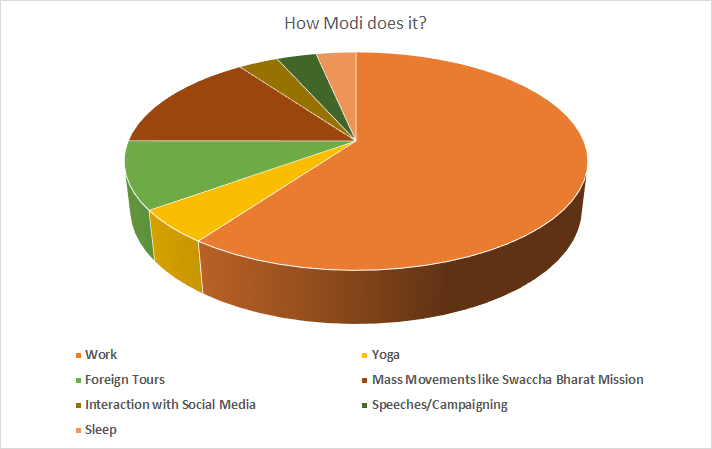
Here with this satirical article I have tried to put information in the right perspective with the aid of pie charts.


The images used in the article are digitally copyrighted. They cannot be reproduced on other blogs/websites without prior permissions and accreditation of the source.